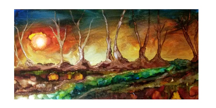
All Alcohol Paintings shown in this post by the Author- Dawn Bank
While searching for ways to expand “the oil painting experience” I came across tiny bottles of Alcohol Inks in all the basic colours, with an extender (strictly rubbing alcohol at 99%) as well as some clean-up solution.
Painting with oils has always been my favorite medium but on occasion I find it kind of rigid- you do this…then that and poof you have a beautiful tree. That’s why using alcohol inks as my new medium has become a new addiction. While doing so, I feel like I am being controlled without the ability to stop working. I have probably used up 3 sets so far.
I had never used inks before and I found myself in uncharted territory. Using inks changed everything. I discovered that they created many outcomes and endless possibilities which then opened up new means of expression to me.
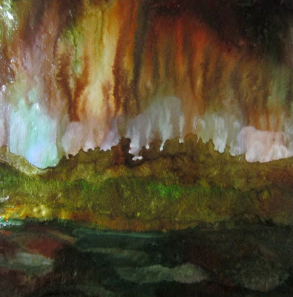
Taking advantage of the translucent qualities of Alcohol Ink- lit (L) & unlit (R) candle holder by the Author
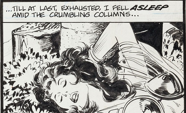
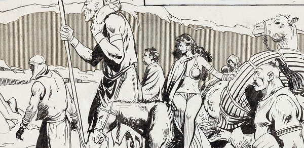
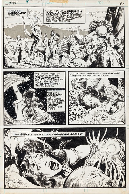
When I begin to ink, I sit down at my table the same way I would when using oils. I Toss little droplets of colour and rotate the tile. Next, I spray rubbing alcohol for a spatter effect and I add a sponging technique that forms a multitude of tiny blotches. I pick out a brush and paint with the alcohol itself paying attention to watching the delicate lines that form as the brush hits the nearly-dry ink. It’s a gentle process and I enjoy the thinning of colour effect from the alcohol spray . For more fun I sometimes go out and buy a can of compressed air. I blow the ink and watch as it begins to layer itself. This is almost magical. It’s so amazing how it all comes together. I think the greatest addiction with this technique is the fact that the results are unpredictable and will never be the same. This whole process takes about half an hour but to me it seems like mere seconds.
Even though the finished ink works are fully dry within a matter of minutes, extra time is required if you choose to work in more detailed designs.
Another view of the Author’s candle holder
Speaking of time….I am amazed that while I work with the inks I completely lose all track of time. I am in a completely different space. My house could be burning down and I’m not sure that I would notice because using this medium makes me extremely focused and relaxed. Peacefulness has added to my life and that is just amazing. I have become so “in tune” with the way that the inks move without totally blending together. It’s an exciting time. I have discovered a new way to express and share my world with the whole world. For The Silo, Dawn Bank of One Lady’s Art. To view more alcohol ink work please visit me at https://www.facebook.com/groups/OneLadysArt/.
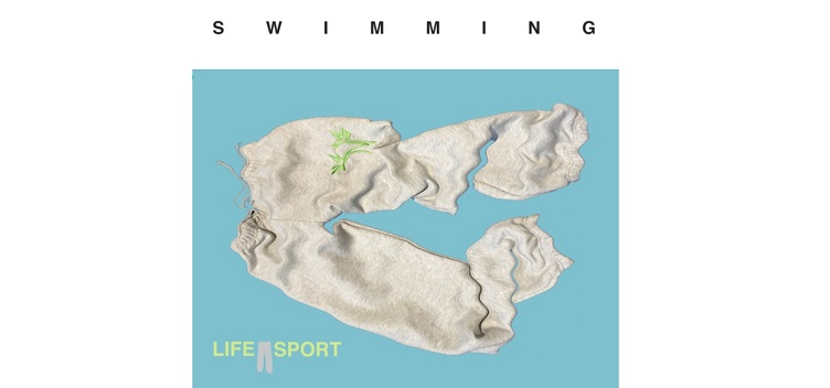
LIFE SPORT (est. 2014) is both a sweatpants shop and an art space. Based in Athens, we aim to become a fully functioning shop with the intent to generate alternative arts funding in a time and place where there is none. Hosting presentations, spoken word and services, LIFE SPORT is invested in the experiment of the invention of life as sport, whilst encouraging collaborations with artists that share our ambition to reclaim independence and self-empowerment.
LIFE SPORT sweatpants are critical wearables made of 70% cotton and 30% polyester and are entirely produced in Athens. This product is the result of a year-long research and observation of Athenian lifestyles, taking sweatpants and their wearers as the starting point for a portrait of a city. Sweatpants are everywhere, they defy notions of social stratification, gender and age. Sweatpants unite contradiction, they are a symbol of defeat or paralysis for some, a statement of ultimate resistance and emancipation for others. At the very least, they are really comfortable, fit everyone and wash at 40 degrees.
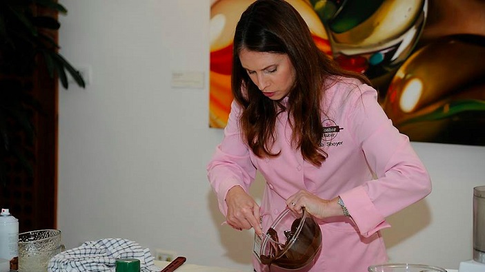
The Jewish High Holidays are a time when family and friends come together to share a meal and celebrate the new year. Paris-trained pastry chef, Paula Shoyer created the essential baking book for that provides desserts and breads perfect for any Jewish holiday or dinner. THE HOLIDAY KOSHER BAKER has desserts that follow the latest trends but also recipes that remind us of those our grandmothers used to make – but with Paula’s distinctively modern and healthier twist.
Even modern Jewish bakers gravitate towards traditional Jewish recipes when they bake for Rosh Hashanah. Maybe it is because Rosh Hashanah, one of the most significant holidays of the Jewish calendar, deserves baked goods that are central to the rich Jewish culinary tradition. These classics include rugelach, strudel, babka, honey and apple cakes, and, of course, round challahs.
“I have always tried to honor tradition, because I want my children to grow up appreciating classic Jewish food, but I have tried to vary the recipes to make them more interesting to a modern audience,” Paula explains. Paula’s take on babka are mini babka bites, she turned honey cake into crunchy biscotti and below recipes for a strudel that combines fresh and dried fruit, and challah rolls filled with the classics: apples and honey.
This New Year, sweeten up your dinner table with two of Paula’s delicious recipes:
(Recipes from The Holiday Kosher Baker by Paula Shoyer Sterling / November 2013)
Apricot and Berry Strudel
Makes 2 rolls, serves 10
For this recipe, I took apple strudel, a delicious dessert that has been absent from holiday tables since my childhood, and instead substituted berries and dried fruit for the apples. You could also make this dessert with plums, or substitute dates or dried figs for the apricots. You will have enough filo to double the recipe and can easily double the filling to serve more people. I always thought the filo came in large boxes and needed trimming, but recently learned that it also comes in smaller, about 8 X 12-inch, sheets. They are easy to work with and were used to make the cute rolls pictured here.
1 cup dried apricots, chopped into 1/3- inch pieces
1 ½ cups (6 ounces) blackberries or blueberries
3 tablespoons sugar
1 tablespoon cornstarch
1 pound filo dough (8 X 12-inch sheets), thawed according to package directions
Spray oil
Preheat oven 350°F. Line a jelly roll pan with parchment. Set aside. Place the chopped apricots and berries into a medium bowl. Add the sugar and cornstarch and toss lightly. Set aside.
Have ready a clean, damp dish towel. Place a large piece of parchment paper on the counter. Take the filo out of its package and unroll. Separate one sheet and place on top of the parchment. Spray with the oil. Place a second sheet on top and spray again. Repeat with two more sheets. Cover the remaining filo with the damp towel.
Place ½ of the filling along the long end of the filo, two inches from the edge. Fold the right and left sides (the short sides) in one inch. Starting from the side with the filling, roll up tightly until you have a long log. Place on the baking sheet. Repeat to make another log.
Bake for 40 minutes, or until lightly browned on top. Let cool and cut into two-inch slices. Serve warm or at room temperature. Store covered at room temperature for up to two days. Reheat to serve.
Apple and Honey Challah Rolls
Makes 24 rolls
I filled these delicious rolls with cooked apples and honey, which we eat at the beginning of the meal and wish everyone a sweet new year. Almost every year on Rosh Hashanah I host at least 25 people in my home. I give each guest their own small plate with a challah roll, apple slices and small bowl of honey to save some of the time that slips away when passing these essential holiday elements around the table. Perhaps I invented these challah rolls that are filled with sautéed apples and honey to further streamline the entire beginning of the meal?
Dough
1/2 ounce (2 envelopes) dry yeast
1/2 cup warm water
1 cup boiling water
½ cup cold water
½ cup plus 1 teaspoon canola oil, divided
1 tablespoon salt
2/3 cup plus 1 teaspoon sugar, divided
3 large eggs
1 teaspoon pure vanilla extract
2 teaspoons cinnamon
6 ¼ to 6 ½ cups bread flour
Apples
5 Gala or Fuji apples
2 tablespoons oil
1/3 cup light brown sugar
1 tablespoon honey
2 teaspoons cinnamon, divided
2 pinches nutmeg
Glaze
Reserved egg plus 2 teaspoons water
1 tablespoon honey
Place 1/3 cup warm water into a liquid measuring cup. Add the yeast and teaspoon sugar and mix. Let sit five minutes, or until thick. Meanwhile, in a large mixing bowl, place 1/2 cup of the oil, salt and 2/3 cup sugar. Whisk well. Add the boiling water and whisk to dissolve the salt and sugar. Add the cold water and mix again.
Beat the eggs in a separate bowl and add to oil mixture, reserving one tablespoon to brush on the loaves. Cover the reserved egg and place in the fridge. Add the vanilla and cinnamon to the bowl and whisk in. Do not worry that the cinnamon does not dissolve; it will mix in later. When the yeast bubbles, add the yeast mixture to the bowl and stir.
Add 6 cups of the flour, one cup at a time, mixing the flour in completely after each addition. You can use the dough hook in a stand mixer. Place the dough on a floured surface and knead until smooth, adding flour a little at a time from the remaining ½ cup. The dough is done when you rub your palm across the dough and it feels soft. Shape the dough into a ball. Lift up the dough and add the remaining one teaspoon oil to the bowl and rub all around the bowl and on top of the dough. Place the dough into the oiled bowl and cover with plastic wrap. Let rise one hour.
Meanwhile, prepare the apples. Peel and core the apples and cut into 1/4-inch cubes. Heat the oil in a large frying pan over medium heat. When hot, add the brown sugar, 1 teaspoon cinnamon, nutmeg and apples. Cook for 5 to 10 minutes, stirring often, until fork tender. You do not want them to be too soft. Add the remaining teaspoon cinnamon and honey and stir. Scoop into another bowl and let cool. If any liquid remains in the bowl, strain out before filling the rolls.
Cover two cookie sheets with parchment paper or silicone baking mats.
When the dough has risen, divide into 24 pieces. Roll each piece into a ball and then roll between your hands into an 8-inch strand. Place horizontally in front of you and use a rolling pin to roll the dough until it is about 4 inches wide. Add one heaping tablespoon of apple filling and use your fingers to spread along the dough the long way. Fold one long side of dough over the filling and then roll up to close. Pinch the edges closed, tucking in any apples that try to escape. Tie each strand into a knot, pulling an end through the top to look like a button, or shape into a spiral by coiling the strand around and tucking in the end. Place on the prepared baking sheets and cover with plastic wrap. Let rise 30 minutes.
Preheat oven to 375°F. Take the reserved egg, add two teaspoons water and one tablespoon honey and stir. Brush the tops of the rolls.
Bake for 20 to 25 minutes, or until lightly browned. Store covered at room temperature for up to three days or freeze for up to three months.
ABOUT PAULA SHOYER
Paula Shoyer is the leading authority on Jewish baking. This busy mother of four believes that a healthy diet can include desserts . . . if they are homemade. A former attorney, she graduated from the Ritz Escoffier pastry program in Paris, and now teaches cooking and baking classes across the country and around the world. Paula is the author of the best-selling The Kosher Baker: Over 160 Dairy-Free Recipes from Traditional to Trendy, The Holiday Kosher Baker, and her first savory cookbook, The New Passover Menu released February 2015. Her books are carried in Williams Sonoma, Crate & Barrel and Costco. She is a contributing editor to several kosher websites such as kosherscoop.com and jewishfoodexperience.com, and magazines such as Joy of Kosher, Whisk, and Hadassah as well as the Washington Post. Paula has appeared on TV 22 times: Food Network’s Sweet Genius, twice on Home & Family on Hallmark Channel, Good Day New York on FOX, San Diego Living, Daytime, and is a frequent guest on several Washington DC news shows. Paula also serves as a consultant for kosher food companies and bakeries. Paula lives in Chevy Chase, MD.
This article focuses on the challenges for authors of dealing with an editor’s and reviewers’ comments within the manuscript publication process. The paper commences with an overview of the peer review process. The nature and style of comments from editors and reviewers is outlined and the inherent meaning demystified. Using a wide range of anonymised examples, sample comments are categorised according to their ease of being addressed and whether or not the author agrees with them and the need to respond highlighted. Advice is offered regarding the construction of a response document, outlining how editor and reviewer comments have been addressed in the revised manuscript and an example comprising both editor and reviewer comments and author responses provided.
The importance of this document in providing a clear audit trail of associated amendments to the manuscript and their justifications in response to the editor’s and reviewers’ comments is emphasised. Céline Rojon and Mark NK Saunders
Skulls & Bones: Skulling the heights of perfection
The skull motif made popular in watchmaking by ArtyA has long been copied, resulting in a whole range of derivatives. Now, the fully independent brand has taken the helm once again. The Skulls & Bones is an extreme timepiece that pushes the creative concept to the limit.
Word has it that if you really can’t compare a Swiss watch to any other, it really is original. By that standard the Skulls & Bones is one original watch.
ArtyA’s latest creation doesn’t do things by halves, and it certainly isn’t a mass-market kind of timepiece. Critics might say that it’s rather extreme – and they wouldn’t be entirely wrong. But more objective minds will first and foremost note its wholly coherent style.
Back in the day, the Skull universe, popularized many years ago by Yvan Arpa, was decried in the world of watchmaking as being in frightfully bad taste. Since then, it’s become trendy and fashionable, as people started wearing this style of timepiece to try and stand out from the crowd – with varying degrees of success. But in most cases, the relevant styling doesn’t go much further than a dial illustration, some sort of ‘skull’ motif on the hands, and little else. Until now, that is.
Skull-tural!
With the Skulls & Bones, ArtyA has embarked once again on the style trajectory it was the first to pioneer (with many following in its wake), as ArtyA’s CEO and designer Yvan Arpa guides the concept to what must surely be its ultimate destination. The skull is much more than a simple drawing: sculpted and engraved, it’s been released from the two-dimensional representations to which it’s been confined elsewhere. As is its wont, ArtyA has suffused the Skulls & Bones symbols with new meaning, taking concepts through to their logical conclusion, and once again placing the artistic dimension at the heart of its work. The dial is fully hand-made.
Crypt- price: 6,900 CHF
Every one of the new 47 mm models is unique, featuring hand-crafted engravings and sculptures. Each includes the brand’s own movement, frequently used in its Son of a Gun collections. This results in a reliable, high-performance caliber, the heart of which is incorporated within a small central space. Its surface is covered by a rough, seemingly unfinished steel plate surface, featuring a twitchy drawing of a skull, rather like a hastily spray-painted tag.
Full Skull- price: 19,000 CHF
This is surrounded by six hand-engraved skulls in polished steel outlined in black. The style is at once tribal and urban, modern and ancestral. ArtyA leaves the interpretation of this universal symbol to each individual’s imagination. By definition, each timepiece will be unique, with each person free to have their own take on the skull universe.
Gangs of skulls
The Skulls & Bones bezel sports another dazzling spectacle, exploring both “skulls” and “bones”. Here, ArtyA extends the core theme to encompass other graphic elements such as crosses, totems, barbed wire, guitars, and guns, expressing the whole gamut of the world of rock. Here too, ArtyA has not gone for simple cookie-cutter drawings, instead favouring genuine steel engravings. The shapes of the movement are seemingly drawn inexorably towards the bezel, each feature setting off the other.
Apocalypse, Timothy deVries (2015) Acrylic on Panel, 30 x 30 inchesClick to buy
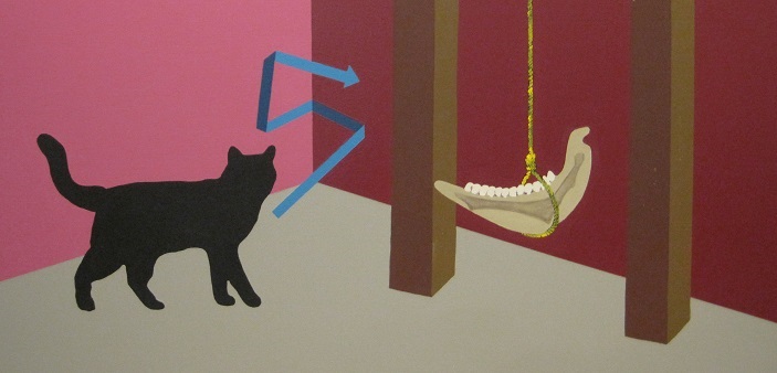
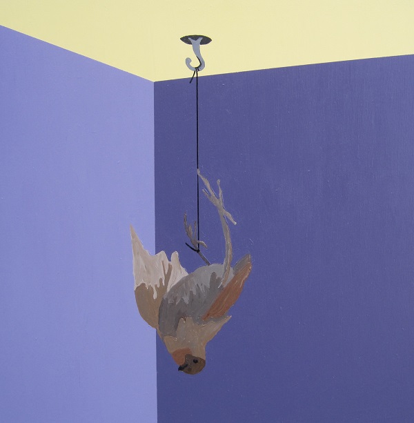
What is a corner? The corner represents a symbolic value. Children are told to stand in the corner when they are disobedient. The corner is a place where one meditates on one’s shortcomings. One can be ‘backed into a corner’ and left with few options or one can retreat into a corner for safety. Animals corner their prey. Corners are places where things get lost and are found. Corners are neglected and swept in the spring. Unfortunate artists can paint themselves into a corner if they are not aware of the space around them and the area beneath their feet. Corners are forgotten with the bustle of activity in the centre of the room.
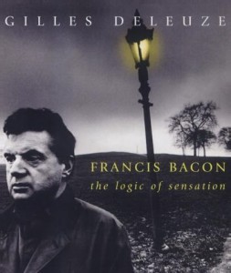
Gilles Deleuze’s book on Francis Bacon contains a short chapter in which he describes some of the possible reasons for why Bacon consistently displayed his figures against a “round area or ring.”1 Deleuze asserts that the main reason for utilizing this “simple technique” is to create a “place” and to isolate the Figure.2 There is a progression and fatefulness in assigning the Figure to this place. Deleuze claims that the round area or ring relates the Figure to the setting and, in so doing, posits the Figure or painting as a kind of fact or isolated reality.3
Bird on a Wire, Timothy deVries (2015) Acrylic on Panel, 18 x 18 inches
The horizon, ring, corner or wall is a painterly convention frequently revisited by contemporary artists. Although many painters have excluded these settings in favour of fields (e.g. a field of pure colour, or a field of refuse), such settings are useful constructs for displaying objects of value or inducing value within objects. Fields are distinct from settings in that they form a systematic or total (rather than operative or local) context for objects. Conversely, settings function by separating the object from its context so that the viewer can have an unmediated experience of that object. The setting recedes ‘into the background’ as a decorative relief or incidental support.
Corners are specific settings that feature the intersection of three planes (i.e. two walls and a floor). The intersection forms a point. The corner can function simply as the intersection of three planes or as a construct that creates depth and dimensionality. This bivalent nature hints at its duplicity as a setting. It creates a false depth. In this respect, the play of surfaces conspires to become a point of convergence or vanishing point. As a convergence of three surfaces it is a point of ‘agreement’, or perhaps a type of foreclosure; three colours and three lines converge to form a dimensional whole. The duplicity of the corner consists of its character as both a play of surfaces and as a convergence of three lines. The duplicity consists in the fact that the corner realizes both the idea of form and the Form itself through both a convergence (of surface and line) and a construction (of dimensionality).
Two of the most significant questions a painter may ask is, “What must I paint?” and “What is the painting about?” The idea of form contained in a painting is inevitably ‘about’ a sensation or perception. The painter’s nervous system is trained not only to recognize particular sensations and perceptions but to actualize them in the materiality of paint.4Painters practice their art as a way of learning to live with a given set of perceptions and sensations. The act of representation in painting is therefore second to the sensations and perceptions which inaugurate it.
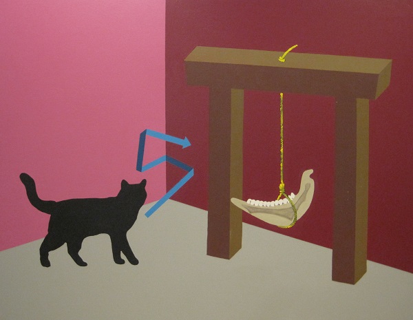
Black Cat and the Jawbone of an Ass, Timothy deVries (2007) Acrylic on Canvas, 46 x 59 inches
The critic’s judgment (i.e. the critique) is the genesis of painterly sensations and perceptions. Critique is the limit of art and limits art to what it alone can do. It functions as a form of violence that is inflicted, observed or endured and occurs when one form overcomes another or when a form is ‘deformed’ by a superior consciousness. The deformation heralds a new and hitherto unappreciated beauty. It is the beauty of a projection or displacement of the painter’s subjective point of view into the materiality of paint. The transformation of sensations and perceptions through the pure and practical reason of the painter reflects the painter’s critique of power. What power? The power of judgment. The critique is therefore absorbed into the very colour of the picture.
Ludwig Wittgenstein’s picture theory holds great explanatory appeal in these cases because it contains propositions regarding the logic and structure of a picture. The painter labels the painting with a title because it represents a state of affairs. There is a close correspondence between the fact represented by the title and the pictorial content of the painting. It is in this sense that the picture functions as a relation between the physical or material world and the thoughts of the painter. Within this context, pictures are criticological constructs. Their titles are statements or propositions that are endowed with sense. As a function of these statements the painting’s pictorial components correspond almost identically with a set of defined elementary forces.
The corner can therefore play several conscious roles within a painting. They are the place of an encounter between a convergence and a defined space. These corners embody a perception. Moreover, corners function as a limit. As the limit of pictorial space they set up a picture plane that functions as a limit to logical thought. By using corners in this way, painters can represent unusual objects with a degree of normative ‘factuality’ – even if they are only representations. Finally, corners function as a place or setting. These corners are settings in which something can take place as well as a destination for various ideas. They instantiate and materialize Form in unanticipated ways. For the Silo, Timothy deVries http://www.timothydevries.ca/
Gilles Deleuze, Francis Bacon: The Logic of Sensation (New York: Continuum, 2003), 1
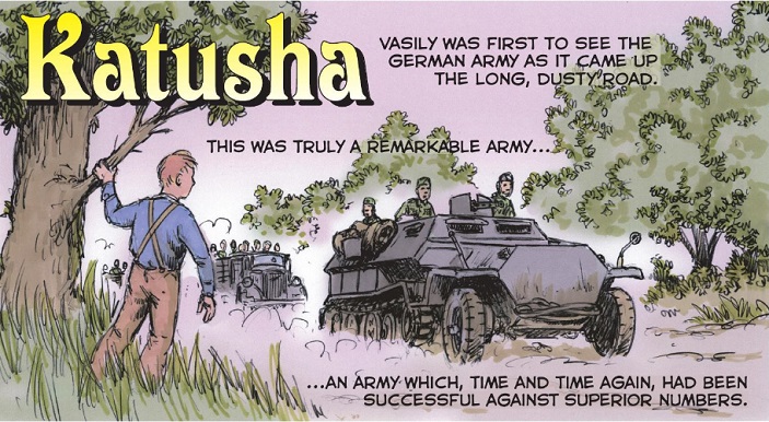
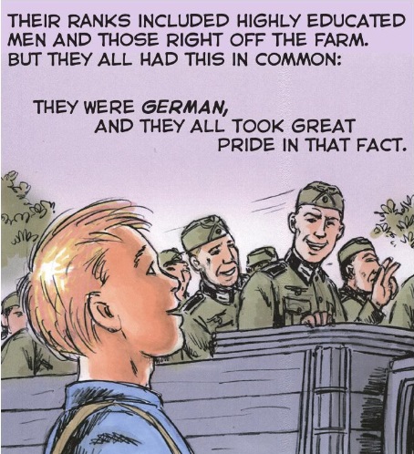
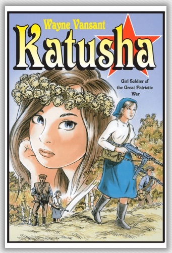
Garth Ennis: “Wayne Vansant has done a magnificent job with these first two volumes of Katusha.”
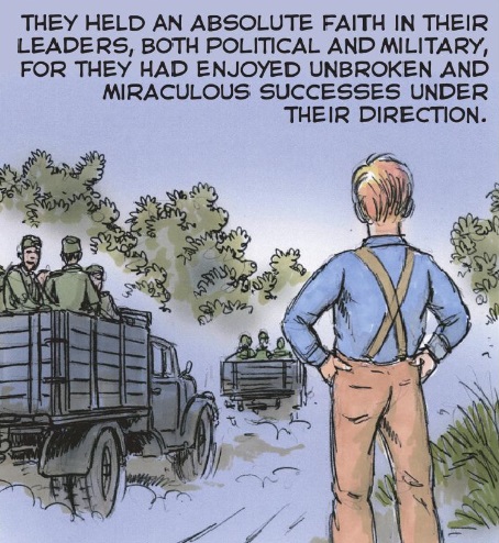
Wayne Vansant’s epic war story KATUSHA, GIRL SOLDIER OF THE GREAT PATRIOTIC WAR is being made available to read for free atwww.katushagirlsoldier.com. KATUSHA (according to babynology.com, Katusha is a dimunitive form of Russian Ekaterina and Yekaterina, meaning “little pure one”. Katusha is also a famed Russian war song written shortly before World War II) tells the story of a farm girl from Ukraine who becomes a Red Army tank commander during World War II.A coming-of-age story told against the backdrop of the bloodiest conflict in human history, the 1941-1945 Eastern Front between Nazi Germany and Soviet Russia, KATUSHA is created by writer/artist Wayne Vansant (Marvel’s THE NAM, Zenith’s Graphic Histories series). Inspired by the experiences of thousands of women who served in the Red Army as pilots, snipers, tank drivers, and other roles, it forms a sprawling epic that will total three volumes and over five-hundred pages upon completion.
The first two graphic novels in the series, KATUSHA BOOK ONE: EDGE OF DARKNESS and KATUSHA BOOK TWO: THE SHAKING OF THE EARTHare currently available in digital and print format from Grand Design Publishing. The webcomic version of KATUSHA will serialize both, adding a new page every day, with BOOK ONE completing in June and BOOK TWO completing at the end of 2015. The third and final volume, expected in print in mid-2015, will begin serialization in January 2016.
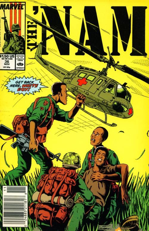
One of Vansant’s previous works, The ‘Nam was an innovative and truly seminal comic.
KATUSHA has received praise from critics and comics professionals. History magazine Armchair General Magazine included KATUSHA in its “Stuff We Like” column. PatMills, writer of the legendary British war comics series CHARLIE’S WAR has praised Katusha for dealing with a chapter in history that’s been overlooked in the West. Garth Ennis, writer of PREACHER and WAR STORIES (which includes THE NIGHT WITCHES, a story about Soviet women pilots) said of Katusha, “It’s great to see the story of the Soviet women tankers kept alive. Wayne Vansant has done a magnificent job with these first two volumes of Katusha; I look forward to reading more”. Print editions are now available from Amazon.com, Barnesandnoble.com and other online retailers. Ebook editions are available to consumers through ComicsPlus, Google Play, Kindle, and (soon) Comixology, and to libraries though Overdrive and iVerse.
Wayne Vansant and a blowup of his new work-in-progress: Katusha
KATUSHA BOOK ONE opens with young Katusha’s graduation from her tenth and final year of school. The next morning, Sunday June 22, 1941, Nazi Germany invades the Soviet Union. The young woman and her family escape to the forests to begin a partisan war against the German occupiers. In KATUSHA BOOK TWO, Katusha and her sister Milla join the Red Army and are sent to tank school. Trained to operate the mighty T-34, Katusha fights from countryside to cities and learns the steep price to pay for victory.
Vansant has chronicled history in comics format since 1986. He was the primary artist for Marvel’s acclaimed Vietnam War title, THE ‘NAM, and he has recently returned to historical fiction with his three-volume series KATUSHA, an epic of the eastern front of World War II. He has researched, written, and illustrated many non-fiction graphic novels on subjects including the Korean War, Abraham Lincoln and Frederick Douglas, and the Battle of Antietam. Since 2013 Vansant has released six non-fiction graphic novels through Zenith Publishing. Vansant is a native of Georgia and served in the United States Navy during the Vietnam War era.
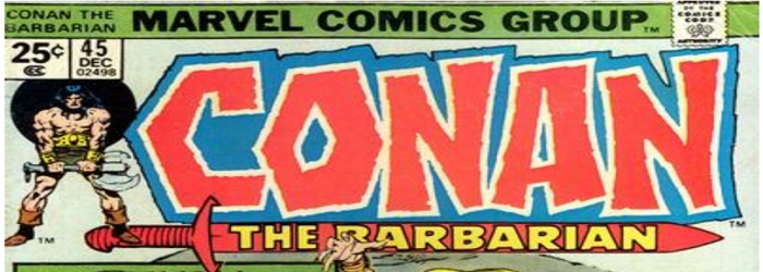
John Buscema and the Crusty BunkersConan the Barbarian#45 Page 16 Original Art (Marvel, 1974). Wondrous and horrible things await in this page from “The Last Ballad of Laza-Lanti,” written by Roy Thomas. The ink on Bristol art has an image area of 10″ x 15″ and it is in Very Good condition. Let’s take a look at a single panel from the page on offer.
Fans of 1970’s/1980’s Conan the Barbarian graphic comics appreciate the moody almost expressionist pencil and inks.
Buscema, John:John Buscema (American 1927-2002): After the departure of Jack Kirby from Marvel in 1970, John Buscema became one of the company’s most influential artists [Often called the Michelangelo of comics CP]. Buscema is perhaps most celebrated for his Bronze Age work on the Avengers, the Silver Surfer, and Conan the Barbarian. Buscema’s work proved so in-demand in the mid-seventies, he launched the John Buscema Art School which advertised for students in the pages of many Marvel titles. Stan Lee made appearances as a guest lecturer at Buscema’s school and the two collaborated on the wildly popular book How to Draw Comics The Marvel Way, Simon and Schuster, 1978. Comic Art
The page was sold to the highest bid which reached $US 2,210.75
Inside Every Man Lives the Seed of a Flower (13.21)
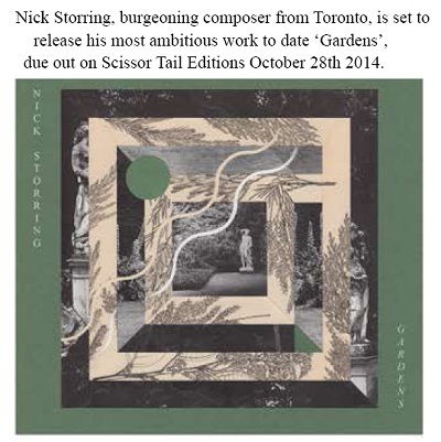
Maestro Nick Storring- not afraid to integrate electronics into classical instrumentation
Gardens was composed, performed, recorded and mixed spring 2011-autumn 2013. All instruments performed by Nick Storring. The work was designed as an informal tribute to arranger/ producer/ composer Charles Stepney. Its titles refer to the Come To My Garden by Minnie Riperton which Stepney co-wrote, produced and arranged. No musical materials were borrowed, however.
The creative processes which birthed this album was funded by the 2011 Toronto Emerging Composer Award, which is administered by the Canadian Music Centre and generously supported by Michael Koerner and Roger D. Moore. No effects processing was employed aside from simple dynamics, equalization, mixing, and spatialization. Other ‘processing’ is strictly through acoustic or electromechanical means.
Instrumentation: violin, cello, electric mandola, electric bass, guitalele, Strumstick, banjo, harpsicle, autoharp, esraj, kemence, rebab, ananda lahari, Hohner Pianet-T, Yamaha CP60M stage piano, glockenspiel, steel pan, thumb pianos, toy pianos, roto-toms, snare drum, djembe, khol, bells, thunder tubes, rainstick, woodblocks, cymbals, other found/ homemade percussion, jaw harps, melodicas, harmonicas (diatonic and chromatic), tuning reeds, harmonium, khêne, mey, hulosi, xaphoon, concert flute, bansuris, sulings, recorders (alto, soprano, sopranino), various other flutes, mijwiz, been, pan pipes, kazoo, found wind instruments, voice.
Many thanks to those who offered listening, feedback, instruments, support and exposure (through various channels) during the creation of this work. There are many of you, and I truly value your contributions.
TRDWTR, pronounced ‘treadwater’, is a mature take on the superhero genre, set in a plausible geopolitical future. The franchise will kick off with a graphic novel on September 30th, 2014. A live-action series based on the novel is set to follow suit in 2015. A preview of the graphic novel will be staged in America’s largest comic book store today, September 10th. To commemorate the launch, a teaser trailer for the TRDWTR franchise has been made available to the general public. And here it is!
Be sure to ‘like’ Johnny’s Facebook “Jam Page” (link at the end of this article)- you can find live videos, recordings and other trivia and info about Johnny Mac Slater.
For those in the country music scene, talented Johnny Mac has a song for you. Known first to family and friends as John McIntosh, he added ‘Slater’ as a surname, hence his stage name is Johnny Mac Slater. It is a handle that fits his style well. He writes stories from the heart and magically transforms the words into beautiful songs which he sings and plays. Johnny Mac Slater spent some time in Nashville, writing songs and developing his craft. Now living in Hamilton, and happy to be close to his roots, he is working on a new project. Johnny says “I’ve recently been recording at Westmoreland Recording Studios in Hamilton for awhile now, and a CD release will happen soon.”You can bet he will stick with his life’s stories and experiences. Typically his lyrics are centered around girls and love, both lost or found, and then performed with passion and filled with emotion. He also appreciates a good party and quirky story. All of which are found in his songs. It is easy to see, he feels that “nothing makes a better song than a good story.”Some of his early influences you’ll find varied, including Glen Campbell, Keith Urban, Eric Church, Micheal Martin Murphy, Elton John, Kris Kristofferson, and even Boston, Pete Townsend and Motley Crue.The musicians he has teamed up with for his soon to be released CD have added some great sound. From a strong drum beat, clean bass lines and some very sweet guitar licks. There is no doubt it will be a hit CD. Watch his You Tube home page for a sneak preview of a song or two that will be on the new CD.
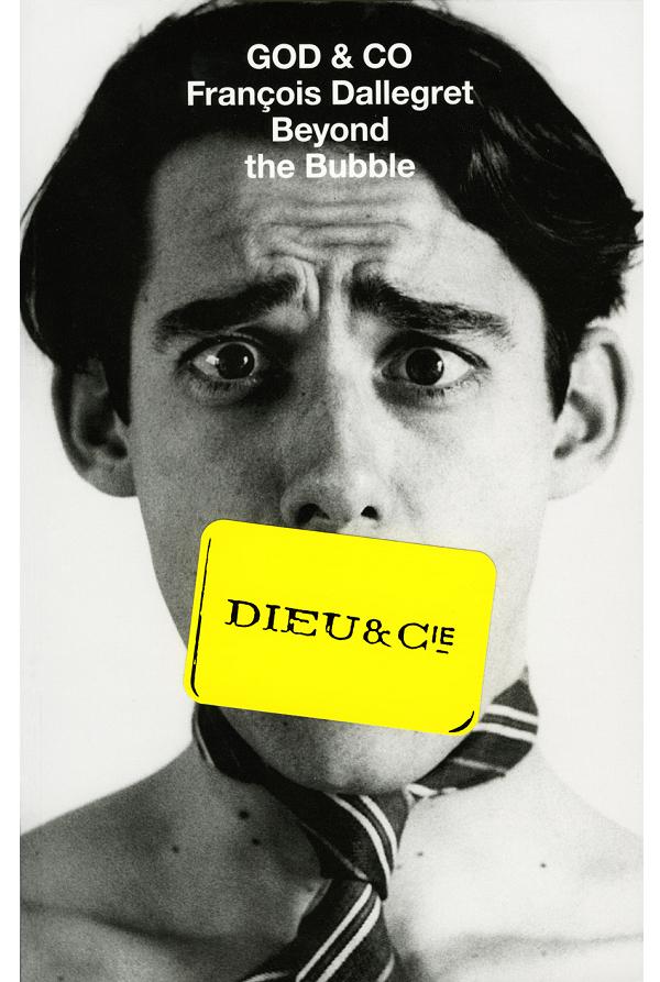
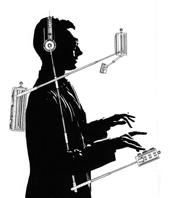
François Dallegret, L’IntroConversoMAtic, 1963. photo collage and drawing. Dimensions variable. Photo: François Dallegret
In 2014 McMaster Museum of Art presented GOD & CO: François Dallegret Beyond the Bubble. An exhibition organized by the Architectural Association, London UK
François Dallegret trained as an architect at the École des Beaux-Arts in Paris in the late 1950s. He moved to North America; first to New York and then Montreal in 1964. Dallegret has since and continues to slip between disciplines, working as an artist, entrepreneur, theoretical architect (before the term was in general use), industrial and graphic designer, writer and social commentator.
Although his work over the past fifty years has been firmly planted within the possibilities offered by contemporary technologies—his 1964 drawing of a personal, wrap-around electronic communicator l’intro conversomatic has become a commonplace reality in the current world of smart phones & “pads”—Dallegret can be seen been in the context of 19th century idealism; the engineer as artist, the inventor as philosopher and so on. And while his work carries the sense of wonder of the modern age, manifest in the pure beauty of the object, it is also tempered by the realities of social, economic and cultural issues, and often framed with a quixotic sense of humour and irony.
GOD & CO offers a unique view into Dallegret’s work and activities, a de facto retrospective that engages his active thoughts. Organized by the Architectural Association School of Architecture (UK), it opened in London in late 2011 and has subsequently been presented in Paris and Zurich. This was the first presentation In Canada.
The 2014 exhibition was accompanied by a 384-page illustrated publication with texts by Alessandra Ponte, Laurent Stalder and Thomas Weaver. For the Silo- RoseAnne Prevec.
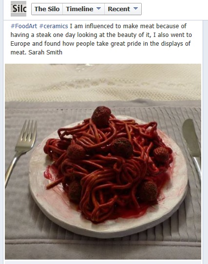
Jack Nicholson, playing The Joker in the 1989 Tim Burton film Batman, said “I don’t know if it’s art, but I LIKE IT!” Looking at artist Sarah Smith’s ersatz ceramic food sculptures I am convinced this work is incredibly effective art. And I like that. A lot.
Part of Smith’s inspiration comes from the cultural differences found when it comes to food preparation and presentation. From her experiences, European’s tend to favor and appreciate food that not only tastes good but looks just as good to match. In the discipline known as culinary arts, the appearance of food is intrinsically linked with the skill of the chef and also with the intended effect on the consumer. In other words, form effects function. Strong components in any art form, Sarah Smith has applied this notion to fake food, emphasizing and reminding the viewer that strong physical reactions can be manipulated through visual presentation.
Throughout time, food has been linked with human emotion and health. Consider this: Apples are associated with our health and death. The “perfect” apple and the “poison” apple. “An apple a day keeps the doctor away.”
Symbiosis of food and the human body. Cucumber slices and orange slices are a remedy for tired eyes and worry lines. Black eyes are healed with a raw steak. Aromatherapy consisting on some level as ‘concentrated scents of food’ (coconut, vanilla, bananas….attempts to create a strong physical reaction such as calming through an associated mental- visual representation. But why is that and is this what Smith is asking us with her food? How do we feel when we see a raw pork chop?
So it’s connections like this that demand we consider Smith’s artistic motivation. Her work exists on many levels. Is it hyper-realism? Surrealism? Pop-art? I believe it is all of those things and more. For the Silo, Jarrod Barker.
“Whenever you offer the highest-graded copy of one of the top comics in the hobby you can bank on fierce bidding,” said Barry Sandoval, Director of Comics Operations for Heritage Auctions. “This auction is an ideal hunting ground for elite collectors and the 9.2 grade example of Batman #1 represents the quality offered throughout the entire event.”
A landmark edition in the halls of American pop culture, Batman #1 features the first appearances of both the Joker and Catwoman, among the very few comic book villains to have attained true “household name” status. It is expected to reach $500,000+.
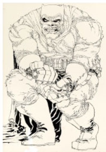
A worthy follow up to such an iconic comic book is Frank Miller’s iconic original cover art to The Dark Knight Returns #2, which also is expected to bring $500,000+. The instantly recognizable image of Batman, crippled with rage, is one of several pieces of original art from the groundbreaking Dark Knight series offered by Heritage in the last year.
“For fans of Modern comics, this drawing is where everything really begins,” said Todd Hignite, Vice President at Heritage Auctions. “This moment defines Miller’s Dark Knight, and the modern day perception of Batman, like no other drawing. The only one that comes close, perhaps, is the iconic Splash page from Dark Knight #3, featuring both Batman and Carrie Kelley (Robin), which we sold two years ago for $448,125.”
Among the high-grade examples of the most coveted comic books ever produced comes a near pristine copy of an increasingly popular comic book, Avengers #1 — in stunning 9.4 grade — is expected to realize $175,000+; a 9.4 grade copy of Tales of Suspense #39, the first appearance of Iron Man, which is expected to bring $100,000+; a rare, 9.0 grade copy of Walt Disney’s Comics and Stories #1 may fetch $30,000+ as the finest copy in a remarkable run that also includes a 9.4 grade of issue #2 and a 9.2 grade of issue #3 from the series, both of which are the highest-graded copies.
A collector’s pick of high-grade examples continues as the only 9.8 grade copy of Marvel Spotlight #5, the first appearance of Ghost Rider, is expected to realize $25,000+.
In addition to the dramatic cover from Dark Knight #2, the auction’s offering of original art includes a remarkable movie poster painted by Frank Frazetta for The Night They Raided Minsky’s. Frazetta usually worked in much smaller sizes, making this 38-inch by 28-1/2-inch poster from 1968 an extreme rarity expected to bring $150,000+.
Perhaps two of the most anticipated lots link to The King of Comics himself, Jack Kirby, to a covert Iranian rescue operation as depicted in the Academy Award-wining film Argo [ See a nod to Canada’s connection in Ben Affleck’s acceptance speech below CP].
The film tells the story of how the CIA used a fake movie production crew to conceal a daring rescue mission of six Americans held in Iran. The “movie within a movie” was at one time a genuine project titled “Lord of Light,” based on the novel by Roger Zelazny. Producer Barry Geller commissioned Jack Kirby to create a set of concept drawings for the film, but the project stalled and was mostly forgotten, until the CIA used it in their top-secret mission. Two of Kirby’s original oversized concept scene drawings for the project — “Pavilions of Joy” and “Planetary Control Room (Interior)” — remain testaments to his signature style and are expected to bring $10,000+ each.
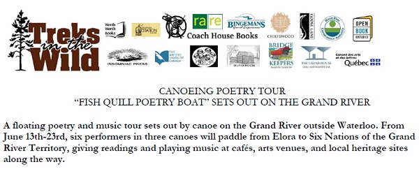
Toronto, ON – A group of artists is setting out on a ten-day poetry and music tour by canoe down the Grand River in southwestern Ontario. For the fourth year running, the group, calling itself Fish Quill Poetry Boat, will be paddling from Elora to the Six Nations of the Grand River Territory and performing their work in cafés, arts centres, and heritage sites along the way. Fish Quill Poetry Boat in 2013 is comprised of poets David Seymour, Gillian Savigny, Leigh Kotsilidis, Linda Besner, and Stewart Cole, with London musician Grey Kingdom.
Fish Quill Poetry Boat will kick off the tour with a performance in Toronto on June 13th at 8pm at the TRANZAC Club. Scheduled stops for Fish Quill Poetry Boat are the Elora’s Beaver House on June 15th, West Montrose Kissing Bridge on June 16th, Waterloo’s Words Worth Books on June 17th, Cambridge’s Wired Up Pugs Café on June 19th, Paris’ Cedar House Martini Bar & Grill on June 20th, Brantford’s Station Coffee House & Gallery on June 21st, and Six Nation’s Chiefswood National Historic Site on June 23rd. With the exception of Toronto (8pm) and Elora (2pm) all performances are at 7pm. Cambridge’s performance has a $10 cover charge, and all other performances are free.
One notable stop on the tour is Chiefswood National Historic Site on June 23rd. Chiefswood is the only surviving pre-Confederation Native mansion in Ontario, and is the birthplace and childhood home of celebrated writer and performer
Tekahionwake, E. Pauline Johnson, best known for her iconic canoeing poem, “The Song My Paddle Sings.” The year 2013 marks the 150th anniversary of Pauline Johnson’s birth. Curator Karen Dearlove says, “We believe that the Fish Quill Poetry Tour is a great way to feature contemporary poetry and creativity at a site known historically for fostering literary creative dreams.” Fish Quill Poetry Boat will be sharing the stage at Chiefswood with local Six Nations writers and performers.
Fish Quill Poetry Boat is in its fourth year, and canoes are once again being lent free of charge by Paris-based outdoor adventure company Treks in the Wild. “A very cool idea,” says Andy Tonkin, canoeing guide and co-owner of Treks in the Wild, who will be coming along for the ride. The Grand River Conservation Authority and rare Charitable Research Reserve also sponsor the tour and will be giving presentations at select venues.
This year Fish Quill Poetry Boat has also put together an Indiegogo crowdfunding campaign. You can watch a video of Leigh Kotsilidis and Linda Besner explaining how the tour works-
As a reward for contributions made, donors to the campaign can receive perks, such an anthology of past and present Fish Quill Poetry Boat participants. So far, that’s fifty poets and musicians! CP
“What a glorious book, vivid, accurate, utterly bewitching.” – Alex Kershaw, bestselling author of The Bedford Boys: One American Town’s Ultimate D-Day Sacrifice
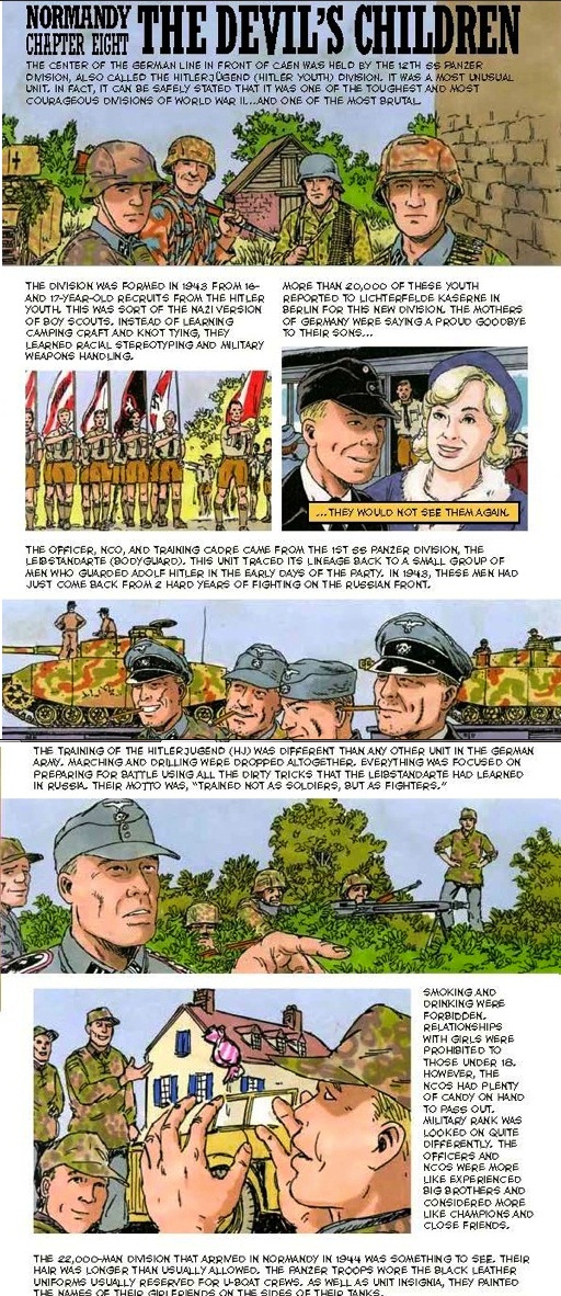
Zenith Press and writer artist Wayne Vansant (Marvel Comics The ‘Nam) offer up 103 entertaining pages in the almanac sized Normandy A Graphic History of D-Day. Tastefully spread out over 15 Chapters, this factual graphic comic tells the story of the Allied invasion of German occupied Europe.
There aren’t any consultant or researcher credits listed in this book but it plays out in a fairly accurate way, with a chronology that starts with the initial Allied paratrooper assault and then the storming of the five D-Day beaches: Utah, Omaha, Gold, Juno, and Sword. Fans of WW2 history know the rest: once ashore, the allies had their work cut out for them as the Germans fell back and defended all the way into Berlin.
Here’s what www.armchairgeneral.com had to say about this books accuracy:
“As with any overview, how much new information a reader learns will depend on how knowledgeable that reader already is on the subject, but Normandy‘s attention to the details makes it worthwhile for adult readers. One of the elements that impressed me most was that the book isn’t just about the Americans. Actions of the British, Canadians, Poles, Free French, and, of course, their German opponents are also given more than just a passing nod.
While some of its chapters cover big-picture subjects (no pun intended, for once) like “Bloody Omaha” or “The Cobra Strikes,” the heart of this book is in its anecdotes about individuals or small groups, such as the story of Stanley Hollis of Britain’s 6th Green Howards using a Sten gun and hand grenades to capture a German bunker, or Michael Wittman’s rampage with his Tiger tank at Villers-Bocage, or Free French soldiers phoning family and friends from the outskirts of Paris to say they’d be home soon.”
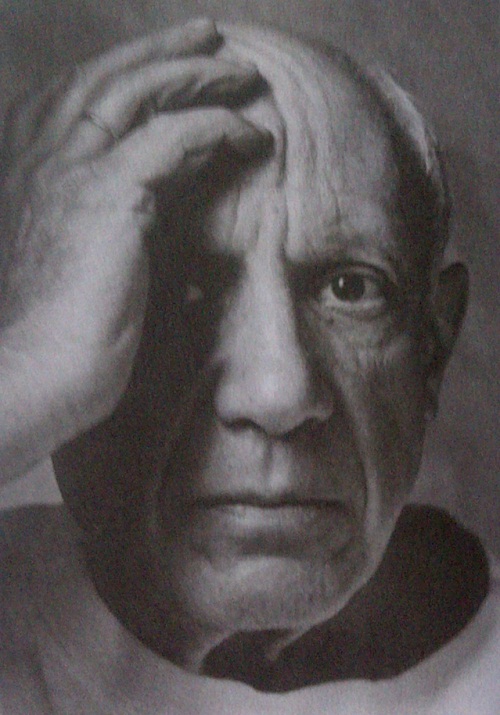
Time flies. Seven years ago, The Silo visited the AGO’s Picasso exhibition. We were not disappointed. Approximately ¼ of the entire second floor was dedicated for displaying works from Picasso’s private collection. That’s right- these are the pieces that Pablo himself deemed specially significant for archiving and for his personal reflection. We were not disappointed.
Blowup and detail from Portait de Dora Maar (Portrait of Dora Maar), 1937. Oil on canvas, 92x65cm
Organized by the Art Gallery of Ontario (AGO) and the Musee National Picasso , Paris- the exhibition is chronologically organized with each period having its own dedicated gallery space and covers the following phases of Picasso’s VASTLY productive lifetime: From Spain to Paris 1900-1905 Ancient, African and Oceanic Inspirations 1906-1909 Cubism, Collage and Constructions 1909-1915 Classicism, Marriage and Family 1914-1924 Surreal Anxiety and Desire 1924-1934 War Paintings 1936-1951 and lastly The Joy of Life and Last Years 1950-1972
According to the Picasso’s Picassos (Picasso’s Early Life and Art) on pg 2 of the AGO’s exhibition catalog, Pablo Picasso was recognized as “an artistic prodigy and began…formal artistic training when he was only seven years old” with his father, who was a painter and an art teacher. For the next 85 (!) years Picasso would go on to not only change the art world, but would leave behind a vast legacy that is as fresh and relevant today as it ever was. Strolling around this fine exhibition and noticing how the other visitors were dressed is proof enough for this writer that Picasso’s influence on society is far from over. For the Silo, Jarrod Barker.
Picasso at 73years of age in 1954. “When I paint I feel that all artists of the past are behind me.”
Artist Jarrod Barker, was recently invited to take part in MUCA-Roma’s Ala Afuera project. Based in the Roma district of Mexico City, MUCA is a University Museum of science and art. What made this project doubly exciting was the opportunity to show case a part of Barker’s home internationally.
The curators asked for a submission of 3 images and accompanying explanatory write-ups that “from your perspective, show a form of relationship between humans and the rest of nature.” This topic aka- Umwelt is not foreign to Barker who installed an exhibition of that name in 2010 at the Norfolk (nee Lynnwood) Arts Center in Simcoe,Ontario.
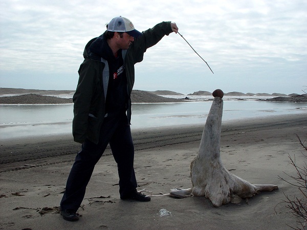
Long Point Seal Tamer Concept- J. Barker Location: Long Point, Norfolk County, Ontario, Canada Long Point is a world biosphere. I know this because the United Nations has told me so. But for several months of the year Long Point is transformed. Under certain winter conditions, Long Point looks less like a marshy, swampy bird watchers paradise and more like an arctic shore. At least on the South West side. When I visit Long Point during these times, I react to the environmental changes. I see things differently. I feel things differently. A sun bleached tree stump becomes a seal. A marsh reed becomes a baton. A flint pebble becomes a ball. Natural transformation through the changes of the seasons is a holistic experience.
After the selection process, if successful- one of the artist submitted images and write-ups was selected for transformation into a postcard and incorporated with the other artist submissions. The goal was for the Ala Afuera team to mail out the postcards to other international Museums of art and science and Contemporary Art institutions as a connective gesture to highlight MUCA and the work of the artists involved in this project and to bring awareness to our human/nature relationships.
“The objective of the project Allá Afuera (Out There) is to gather a mosaic of images that represent ways of understanding the relationship we humans have with the rest of nature. From bucolic or passionate points of view to other more threatening myths and taboos, amazement, fear, the absurd, and maybe even indifference. We do not intend to cover all possibilities, but through images as a direct reading form, show that there are multiple ways of looking at this Bond.
Three times a year we will present a collection of postcards, with 18 images each, gathered in a biombo format. After two years we will complete the edition of six collections, with a total of 108 ways of understanding, 108 points of view, and 108 forms of defining our relationship with what is out there. “
Ala Afuera which translated mean’s “Out there” began mailing out the works a few weeks ago. For the Silo, Stephanie Bordega.
For more information and to request postcards please contact-
Allá Afuera (Out there) project Gonzalo Ortega and Jeronimo Hagerman
MUCA ROMA MUSEUM (University museum of science and art, Roma district, Mexico City) allaafueramucaroma@gmail.com
KATUSHA VOLUME ONE: EDGE OF DARKNESS, the first of a three volume graphic novel series by historical graphic novelist Wayne Vansant, is now available exclusively in digital format from digital publishing imprint Grand Design Communications.
The painting Kateryna by the Ukrainian poet and painter Taras Shevchenko (1814-1861)influenced Katusha. Kateryna tells the story of a Ukrainian country girl who is seduced and abandoned by a Russian cavalry officer.
KATUSHA is a coming-of-age story set in the Eastern Front of World War II, following the life of a Ukrainian farm girl Ekaterina Tymoshenko, nicknamed Katusha, starting with the invasion of the Soviet Union by Nazi Germany in 1941. The three-volume graphic novel, which when finished will total 540 pages, follows her journey from farm girl to partisan fighter to tank commander in the Red Army, along the way participating in the Battles of Stalingrad and Berlin, among others.
During the second world war, hundreds of thousands of Soviet women served in the Red Army as pilots, snipers, tank drivers and other essential roles. Although KATUSHA is a work of fiction, Vansant based his story on interviews he conducted with living veterans in Ukraine and extensive research. He will return for another trip this fall, to conduct more interviews and do research on locations.
Lviv, Ukraine, 26 October 2010 – Canadian Prime Minister Stephen Harper is joined by Ukrainian officials as he pays tribute to Ukrainian poet, artist, and humanist Taras Shevchenko.
KATUSHA VOLUME ONE: EDGE OF DARKNESS, the first of three volumes, is out now exclusively in digital format for iPhone, iPad, Android, and in-browser reading. It is available in two formats – as six separate chapters priced at $.99usd each and as a single one hundred eighty page edition priced at $4.99usd, and can be purchased through iVerse’s ComicsPlus app and from Grand Design’s electronic storefront on iVerse’s website.
A native of Marbleton, Georgia, writer/artist Wayne Vansant has created many historical graphic novels – both fiction and non-fiction – in a career spanning more than twenty five years. His non-fiction graphic novel about the Allied invasion of Europe in World War II, NORMANDY, were be published in September by Zenith Press.
His recent collaboration with writer Dwight Jon Zimmerman, THE HAMMER AND THE ANVIL (2012), a graphic novel about Abraham Lincoln, Frederick Douglass, and the end of slavery in America was published by Hill and Wang, and Vansant was the primary artist for Marvel’s The ‘Nam for more than five years.
His other non-fiction graphic novels on military history include DAYS OF DARKNESS, ANTIETAM: THE FIERY TRIAL (with the United States National Park Service), BLOCKADE: THE CIVIL WAR AT SEA, and THE VIETNAM WAR: A GRAPHIC HISTORY.
Canadian crooner Ori Dagan (well at least half of him)
Ori Dagan (twitter @oridaganjazz) seems to me like a man on a mission. With a rich baritone voice, he has tried to craft a jazz album that is both hip and playful, and, at the same time, a genuine jazz album, complete with standards and heavyweight musicians, and some original tracks as well. Dagan’s album, Less than Three, is a tasty stew of standards and originals with a classic Hebrew song thrown into the mix, and one from his own pen: Nu Az Ma, a call for peace of truly universal dimensions.
Ori Dagan (still from performance) image: www.thesilo.ca
After an opener of Madonna’s Lucky Star (yep, THAT Madonna CP ), which reminded my friend Sophie of a 60’s beat poetry track, with minimalistic base and percussion and funky vocals, Dagan moves to his mother tongue with Eretz Zavat Halav, a Hebrew song featuring the magnificent Jane Bunnett on soprano sax. Bunnett is a true jazz superstar, a multiple Juno award winner and multiple Grammy nominated musician and bandleader who has worked combining Cuban music with new and avant-garde jazz. There was a house down the street from me in west-end Toronto where people told me Jane Bunnett had moved. I used to hear her sax emanating out into the street from a third-story window. It was truly wonderful.
[If there’s any doubt about Ori’s capabilities as a live-on-the-spot performer this youtube video should alleviate. CP]
The material on Dagan’s CD is eclectic. I’ve already mentioned the Madonna cover. There’s also a totally scat version of Lady Gaga’s Bad Romance that is exceedingly fun and features some great scatting too. Not everybody can do that you know. And he throws in some very sensitive renditions of Elton John/Bernie Taupin (This is your Song) and Lloyd Webber/Rice (I’d Be Surprisingly Good for You), to demonstrate a surprising range that can cover modern hits to a cutting, up-tempo Sweet Georgia Brown to round off the album.
This is a very dexterous record featuring a range of styles, and Dagan’s voice is rich, and according to my friend Sophie, sexy. She’d go see him “in a minute.” –CD
In 1968 Simon Kotsch got into the army surplus business. It was good to him, but in ways you might not expect. Something began to happen to Simon as he sorted through his bounty of obsolete engine parts and electrical fittings: he noticed that he found the pieces beautiful. An excitement took hold of him. And then he went to work, drilling and cutting and fitting metal components together to make new things. Beautiful things. He felt “caught up,” he says simply. So began a love affair with military-industrial cast-offs that continues to this day. This was the birth of a sculptor and of a mecha artist.Let us throw aside, officially and forever, the artifice of journalistic objectivity.
I like this guy’s passion and I like his work. When we visited Kotsch’s Victoria St. Studio in Simcoe, Ontario we were greeted with warm smiles that never went away. Taking joy from your work is one thing, but when you combine joy with the sensibility of a true artist who respects, even loves his materials, the results can be magical.Some of Kotsch’s sculptures look like they could have come from the mind of Jules Verne—grand, monumental machines whose functions border on the mysterious, infused with Kotsch’s concern for symmetry and his acute sense of balance, proportion, and pattern. Others have a strong vertical momentum, like castles or rockets with many levels. But not everything has a sci-fi feel.
Kotsch uses the heft and gravity of larger pieces to create powerful and interesting earthbound sculpture. His ability to recognize, or create, striking patterns makes some of his metal works quite decorative to my eye—and that in no way infringes on their status as works of art.
Kotsch says he “savours the natural colour” of each item, whether it’s aluminum, copper, brass or porcelain (used as insulation in old electrical systems). You will not find much (any) painting here. You will also not find much welding. This, by his own admission, is because he’s not very good at it, and mediocre welding would make a sculpture look awful. He cuts and drills to make pieces fit. One technique he has developed is to take slices out of solid machine parts with a band saw, revealing patterns of copper wire within, like opening a geode.
An example of influence: years of working with Army surplus ephemera have inspired Simon’s forms
Simon Kotsch takes obsolete machinery—all of his extensive catalogue of parts predate metric—and turns it into stimulating works of art. We spent about an hour with him, and I left both excited and energized. I, too, had been “caught up.” This is one of the miracles of art for me: through active engagement with an artist’s work a kind of interface occurs between creator and appreciator, mediated through the work itself. I certainly appreciated the skill and imagination of Simon Kotsch, but I think I caught a bit of his love as well. For the Silo, Chris Dowber.
AYR, Ontario — In 2011 when AyrSpace held Canada’s only one hundred-woman art show for the
100th anniversary of International Women’s Day https://www.thesilo.ca/international-women-join-forces-through-art/ , the men took note. The idea of the painting exhibition “Men in Business 2012” was born.
“The idea came to me to encourage the hidden talents among us,” said John Redfern, a Customs
Brokerage executive at The Farrow Group just north of Ayr. Redfern helped realize last year’s effort.
“Jill said to me in an email -15 men would be a perfect number for an exhibition,” referring to Jill Yuzwa, Gallerist at AyrSpace, gallery of visual and functional art. And in similar style to the year prior, a call for collaborators went out through social networks. Men from all economic sectors were encouraged to respond – whether their works be an extension of their day to day or their alter-artistic ego.
Cosmonaut painting (far left) by Jarrod Barker.
And they did respond: a Vancouver architect, a celebrated Canadian documentary film maker, a custom furniture craftsman, educators and leaders of education, independent businessmen, lawyers and a specialized medical technician. The artworks are as varied as the gentlemen themselves. And coincidentally there are 15 collaborators. North Dumfries Mayor Rob Deutschmann will be on hand to welcome the collaborators and open the event on Friday February 3, 2012. “Men in Business 2012” will run through Sunday February 26, 2012.
The exhibition is dedicated to Ayr resident Stephen Gross who is currently undergoing cancer treatment. Mr. Gross is perhaps best known in the Region of Waterloo for his excellent work at the Kitchener Downtown Community Health Centre.
The 15 collaborators of Men in Business 2012 invite the community and collectors to this exhibition and have initiated that partial proceeds of their artworks be allocated to NewmanBoysTrustFund.ca in fond memory of Katherine (Bunny) Newman the Gallerist’s cousin. AyrSpace, gallery of visual and functional art, is located at 44 Stanley Street in downtown Ayr. The gallery opened in October 2008 as a socially innovative collaborative and now represents a range of Canadian artists. www.ayrspace.ca For the Silo, Jill Yuzwa.
Media contact:
Jill Yuzwa
AyrSpace
519.632.9030
art@ayrspace.ca
Definition of art is very difficult to pin down. As an oil painter I look at art one way. An actor would think of it another way. But really the definition doesn’t matter all that much. Art surrounds us wherever we are, if only we choose to see it. Sometimes though, we need to be reminded of that.
When I entered the concentration camp at Terezin in the Czech Republic that November day, the last thing I thought I would see was art. I didn’t know that the children who lived there drew pictures, coloured them, and even wrote poems. But there they were. The paintings and words hung up on the museum wall. The wall was at least 50 feet high. They had miraculously survived Terezin, even when the children themselves had not. I stood in front of that wall for a long time, hesitant to leave. Afraid that maybe I would need reminding again once I was back home.
Fast forward a year and Terezin has touched my life again. Hana’s Suitcase, which is set in Terezin, is being presented by Theatre Norfolk and COMPASS Theatre Productions, in partnership with W. Ross MacDonald School for the Blind, and I had the opportunity to meet the cast and talk about my experiences at Terezin. I also had the opportunity to watch renowned actor and director Lee MacDougall guide the cast of talented local and emerging actors through the paces of this emotional, heart wrenching play which took me right back to that wall.
Silo Behind the Scenes: Rehearsal of Hanna's Suitcase
In this play child actors play some of the main characters. Hana was sent to Terezin when she was 11. This play is being performed for over 1200 students in Grades 4-12; Children teaching children and because this play is for everyone; children teaching adults. It speaks to hatred and intolerance. It also speaks to hope and beauty. It’s amazing how children are able to see both at the same time. I wonder when we, as adults, forget how to do that.
I hope that you will take the time to see Hana’s Suitcase and be reminded of all the things that you should never forget while watching art at its finest.
Hana’s Suitcase, adapted by Emil Sher based on the book by Karen Levine, is being presented at W. Ross MacDonald Auditorium Dec. 2nd, 3rd & 4th. Tickets are on
sale at Scotia Bank, Lynden Road, and at the Lighthouse Festival Theatre. For more info and to purchase tickets visit Silo Direct Link to Theatre Norfolk Website
The first thing I noticed was the pebbles. There had to be a hundred. Maybe more.
All perched lovingly atop the unmarked grave. I took a deep breath and went closer.
Each step taken with respect. To those underneath the pebbles, their families, their communities, their lives.
Time stopped.
I knelt.
My hand reached out. Hovered over the pebbles asking permission to enter their world for just a few hours.
I was humbled. I was ready.
I will never forget.
So began my journey to Terezin in the Czech Republic that November day. I knew it would change me. I knew what I would see.
I knew nothing. Absolutely nothing.
How could I know? I had not yet seen. I had not yet felt. I had not yet heard the door slam behind me.
I didn’t know about the children. I didn’t know they drew pictures. Pictures of flowers and trees, family and dogs. Pictures like all kids draw. Only they weren’t all kids. They lived at Terezin.
I was ready.
I had watched the movies.
I had watched the documentaries
in my comfortable chair in my warm living room.
Now I’ve stood where they stood.
Sat where they sat.
Cried where they cried.
I know it’s not enough.
But I will never forget.
Will always speak up.
Will always remember the pebbles.
The Bishop’s Man by Canadian author Linden MacIntyre offers a deep and compelling story of one man’s struggle for atonement. The book revolves around a very controversial and current topic, the sexual abuse of children by Catholic Priests. However, this fictional work is much more than a critique on a current situation; it is a journey and dialogue on themes of loneliness, isolation, redemption and spirituality. This novel follows the characters from MacIntyre’s earlier work, The Long Stretch.
MacIntyre begins his story in the present day, sometime in the 1990s, in southern Cape Breton Island. From the beginning, the reader is taken on a journey through the eyes of Father Duncan MacAskill, a priest known as the Exorcist. Father MacAskill, who grew up in this area, is sent for a break from his regular duties, troubleshooting and cleaning up messes made by priests that threaten to embarrass the Catholic Church. Father MacAskill sees this trip home as less of a homecoming and more of a time of spiritual discovery through current events and reflection. MacIntyre weaves present day with the past as he unwinds Father MacAskil’s complicated and somewhat remorseful past.
Father MacAskill is very good at what he does—making troublesome priests disappear by sending them to far off parishes or rehabilitation in Ontario. Upon his return to Creiginish on southern Cape Breton Island, he befriends a young, 19-year-old Danny MacKay from whose father he purchases a boat. Danny’s character is troubled and before Father MacAskill can really reach him and understand the root of his trouble, he commits suicide. This is especially difficult to take in for Father MacAskill when rumours start to swirl that a relationship with a troublesome priest, Brendan Bell, who was sent away from Newfoundland to Craiginish by MacAskill, may have lead to the ruin of Danny MacKay. Upon this revelation, MacIntyre’s story starts to divulge into the past as Father MacAskill tries to sort through his current situation and his spirituality.
The absorbing narrative takes the reader through his missionary work in Honduras in the 1970s, where he has sent to forget what he saw as a young priest between a well respected priest and a young person. The Honduras narrative is threaded between the present day and other reflections. MacIntyre does this seamlessly throughout the novel. Father MacAskill’s stint as dean at St. Francis Xavier is also explored. It is while he is dean at the university he becomes the Bishop’s right hand man and is set out to extinguish potential fires in various churches across Canada. Through all the weaving and reflection, Father MacAskill sorts through his own demons, his past and his family’s problematic and mysterious history.
Although this fictional work discusses a very current and disturbing subject, the sexual abuse of children is never directly addressed or explained in the eyes of Father MacAskill. It serves as a constant undertone to the actions and thoughts of the main character. Linden MacIntyre’s narrative, through the eyes of a troubled priest, provides the reader with a rare insight into the inner workings of the priest hood and the powerful Catholic Church and its place in Canadian culture. For the Silo, Sarah Purdy.


 ABOUT PAULA SHOYER


